VIDEO PROJECT: Arabella Beauty
For this Video project I was inspired to create a business promotional video for my sister small business Arabella Beauty. She’s an esthetician in Victoria BC and has been in business for 2 years now. I wanted to create a video that highlighted her services, expertise in the field and beautiful location of the salon. The purpose of the video is to allow people to get know the business, and hopefully encourage people to book an appointment.
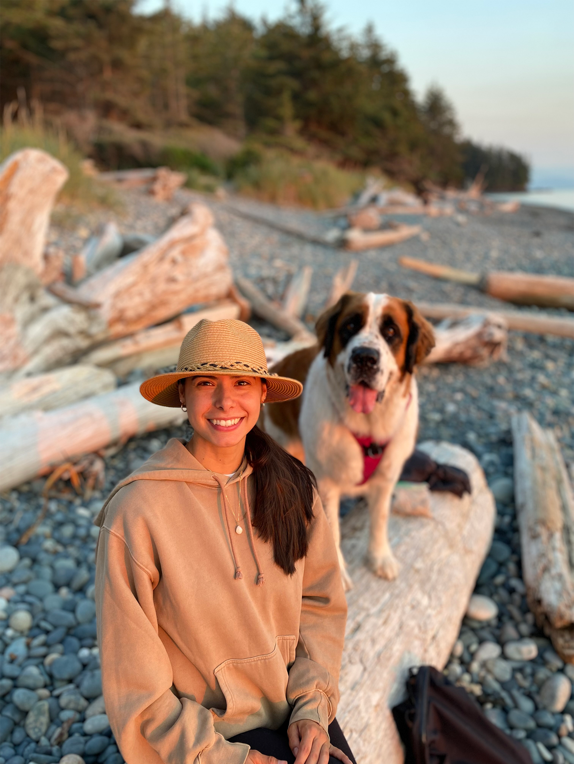
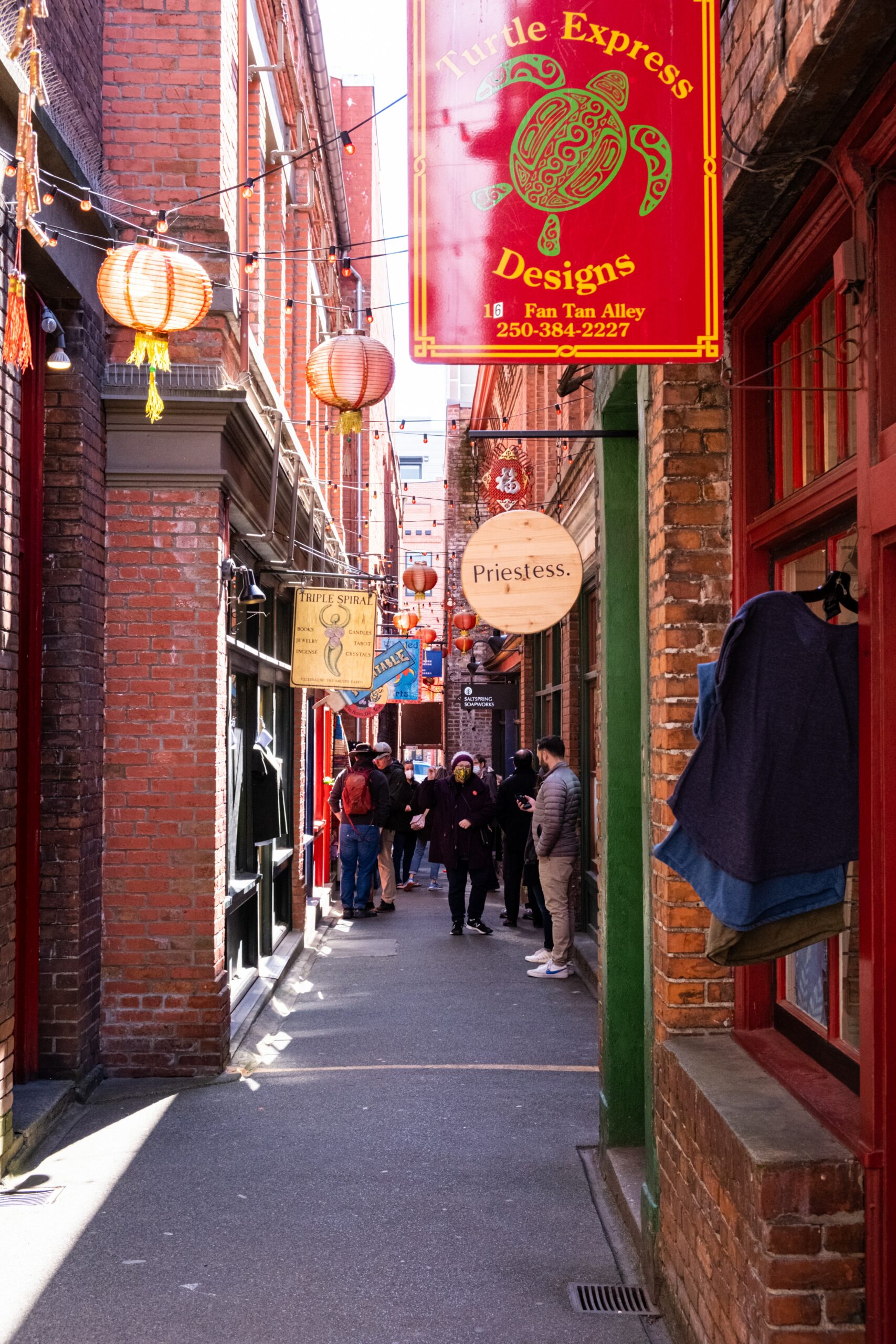
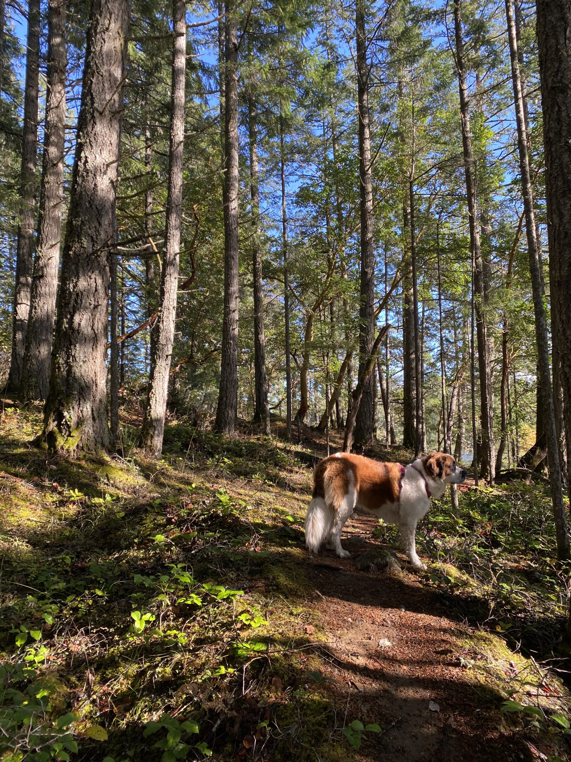
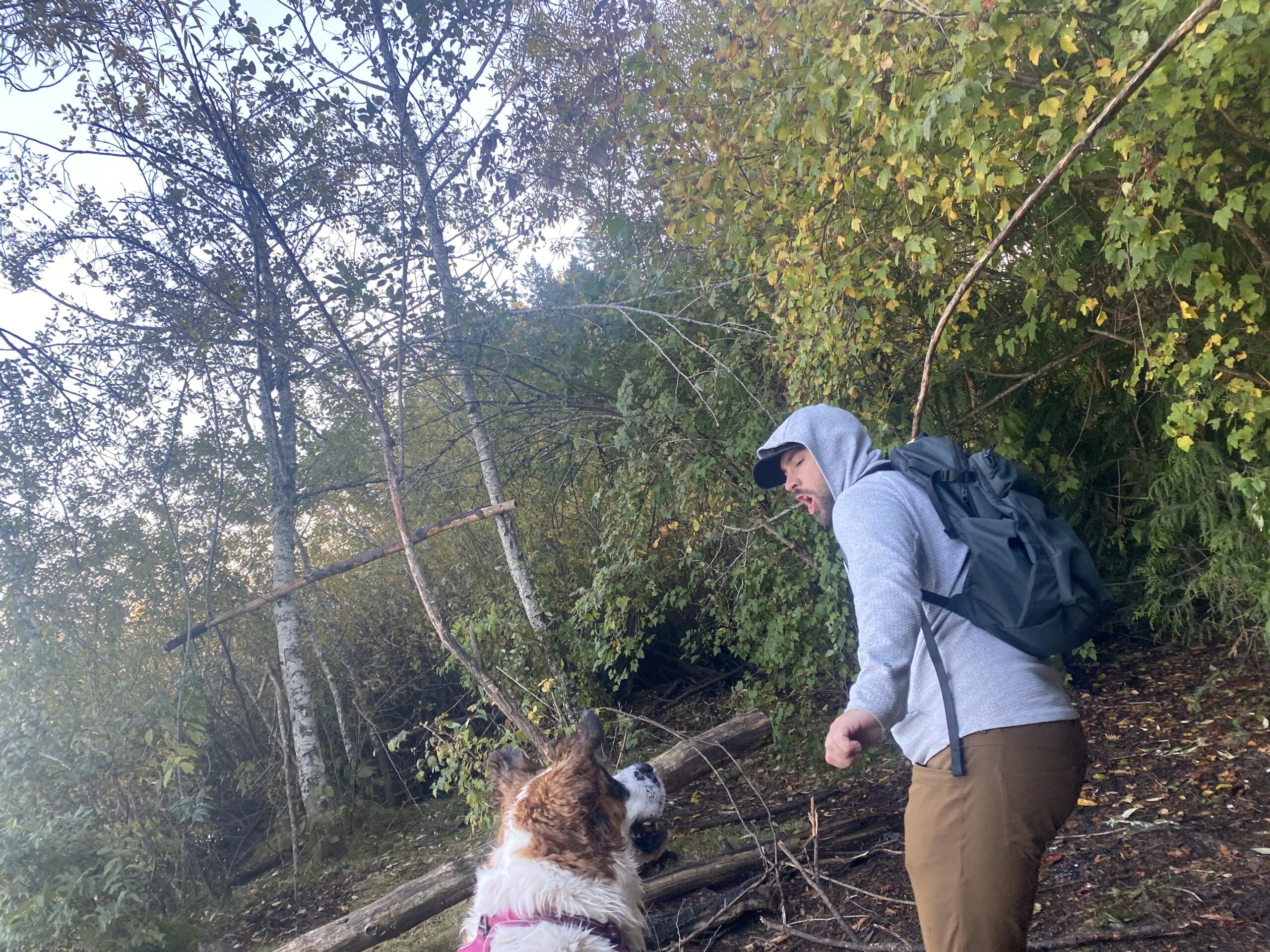
The thumbnails I created earlier in the process is what laid down the ground work and the shots I wanted to capture. I used a preset moving graphic at the beginning and end of the video, and used Arabella Beauty’s logo. Once I got downtown Victoria to film, it was really fun to capture the scenes around me. I used my tripod and my iPhone 11 Pro to capture the beautiful surroundings just as they were. To set the scene, I knew I wanted an establishing shot of Chinatown so you really got a feel of the location. Once I got into the salon space, I used mostly eye level shots for consistency and to build a relationship with Jackie, my main subject. I used my tripod and did slow moving pan around to get a feel of the space. I also explored high angle shot to view the wax products. asked Jackie to talk about her professional experience working in the industry and also how she got into esthetics. I want the viewer to feel a connection with Jackie!
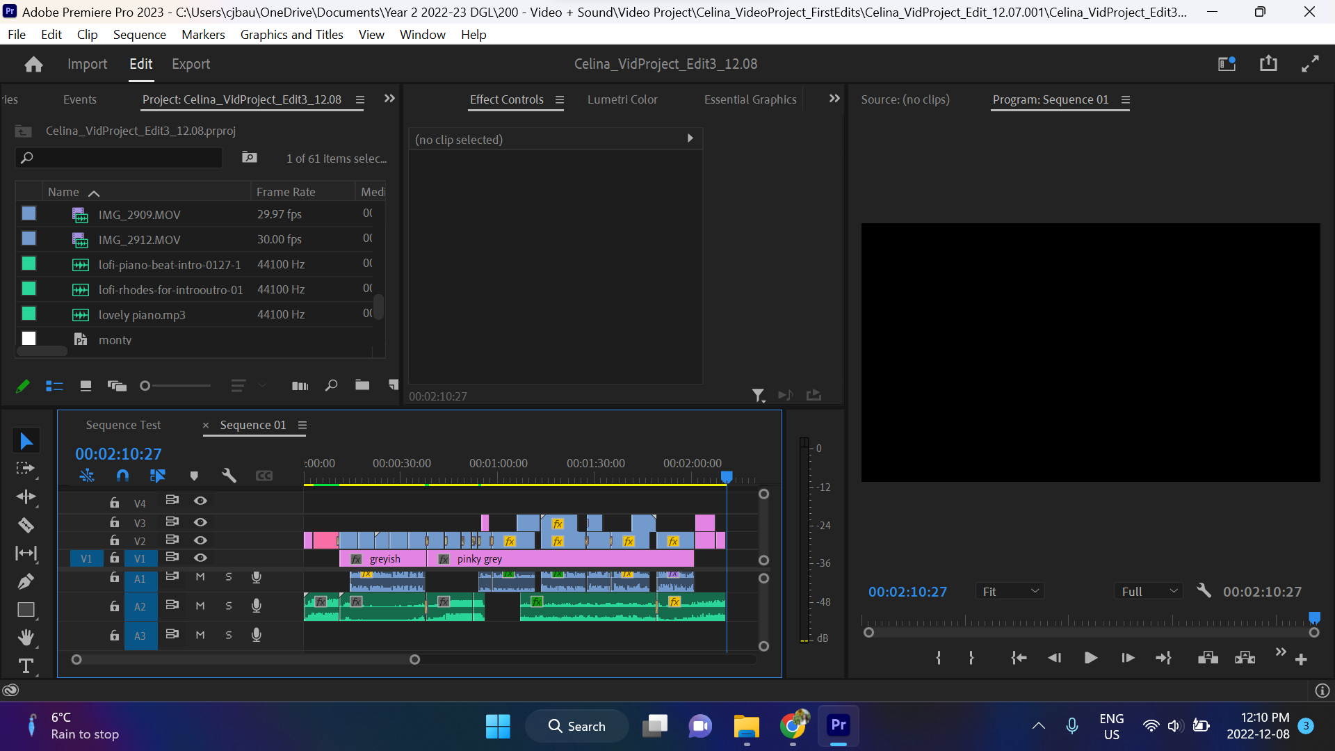
For the editing process, I found all my clips online through the royalty free music and sound websites. I knew I wanted music that was upbeat and that it would keep the viewer interested. I found soft background noises, including a piano track and used it while Jackie was talking and to create levels within the video. I cut up clips and put them back together until I was happy with the flow and storyline. For most scenes, I added a transitional effect between the clips and found it added an energetic flow, especially at the beginning of the video. I also added a colour matter background of the video, to change the colour from straight black to something that suited the content better.
Looking back, I wish I had filmed in Landscape mode because that would have helped for the editing process and make it appear more professional. But overall, this has been a great learning experience and I’m happy with the outcome. I really hope you enjoy watching it!
VIDEO PROJECT DRAFT
Here is my draft of my video project. I plan to continue editing and add colour corrections for clips to create a stronger consistency. I also plan on adding text titles to introduce Jackie, owner of Arabella Beauty. I want to add a couple more video transitions sequences as well. Hope you enjoy.
TECH EX 09
Colour Correct:
For this exercise we followed along a LinkedIn Learning Course and used the Lumetri Scopes and Lumetri Colour Correction to bring out out bolder colours within the video. Using the scopes you can see different colour levels in your footage, including skin tones. Using the scopes and making edits allows you to bring out certain colours and get the look you’re wanting for the video.
Colour Curves:
For this exercise, we continued to edit the same video footage, but instead we used colour curves to get the desired appearance in the video. We explored the use of colour curves as well as edited using the hue and saturation levels. You’re able to pinpoint certain colours and bring out specific desired colours. With Pr you can also copy and paste colour edits onto different clips to get a consistent look and show the viewer that the clips belong together.
Colour SFX:
For this exercise we created this tint overlay for all clips within the video. We followed along a LinkedIn Learning video and showed us all the possible ways to create an effect and apply that same effect to any or all other clips in the sequence. I learned that it does matter the order of which the effects are applied as, if placed in a different order will give a different result. This gives you a lot of flexibility and room to play with each clip.
Spot Colour + Masking:
For this exercise we followed along with Sara’s demo video. We added a spot colour effect on the flower clip to highlight the pink hues in the video to make the flower stand out. We also added and edit to the background of the clip to help the flower stand out even stronger by lowering the hues to look black and white. For the second clip, we added a layering mask to the tea kettle and used the tracking algorithm to ensure the mask is is tracked throughout the whole clip and the mask is only affecting the specific area. It’s great when you want to highlight specific areas within a clip.
TECH EX 08
Titles:
For this exercise, we got to play around with titles within video clips. Titles are useful especially for documentaries to include extra information about the scene. Such as the subject’s name and position. You’re also able to assign animations through the use of keyframes. I found the keyframes tricky to work with, but after tinkering around and getting used to navigating the software was able to figure it out. There are also many free adobe stock options for title templates, which would be very useful and easily editable.
Stills:
For this exercise we worked with a series of stills and images that were edited along with the accompanied music. We then applied the name technique of using keyframes to edit the position and scale of the still to make it appear there is movement. Doing this shows a well rounded scene and can show your viewer the relationship between the subjects in the image. Very interesting to see it all come together!
VIDEO Project – Proposal & Thumbnails
Concept #1 – Trailer
Proposal: Documentary/Business Promotion for Arabella Beauty. Jackie Baulcomb’s (my sister) small business in Victoria BC. She is a beauty professional who focuses on waxing and threading services for hair removal. She started her business 2 years ago, and I want to highlight her and her business. The mood will be light, airy, and feminine focusing on a female owned business providing services for females. I want to feature Jackie in her element and show off the beautiful space she works out of. The video will highlight the location of the salon, the salon space, the great products Jackie uses, Jackie providing a threading service, and Jackie up close and personal. The promotional video will use complimentary (royalty-free) music, clips of Jackie talking about the business, and hustle and bustle from inside and outside the salon space. I hope to promote Jackie and her business.
Formal Elements & Principles: Arabella Beauty, Small Business Feature of Jackie Baulcomb’s hair removal beauty business.
Thumbnails:


Concept #2 – Video Poem
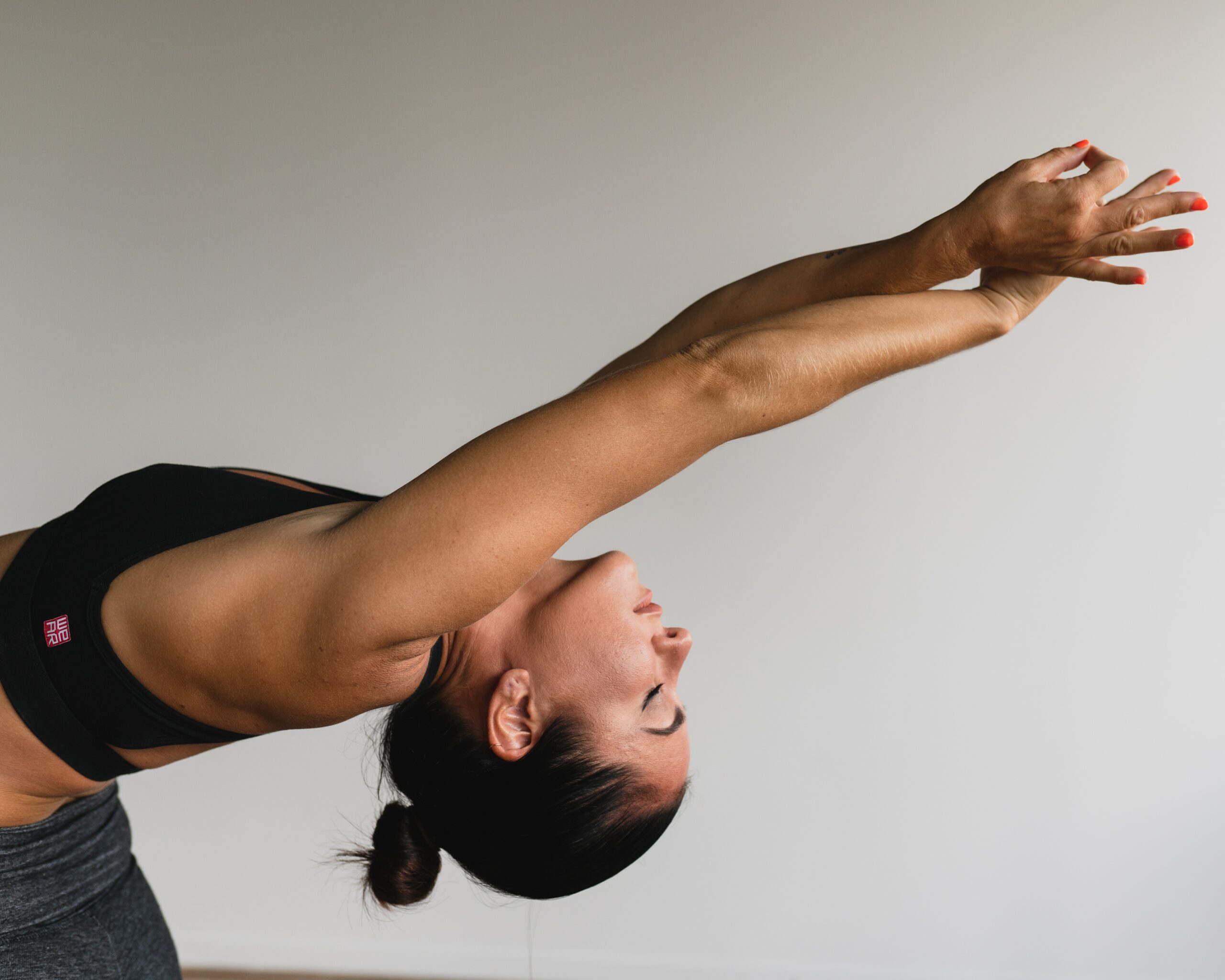
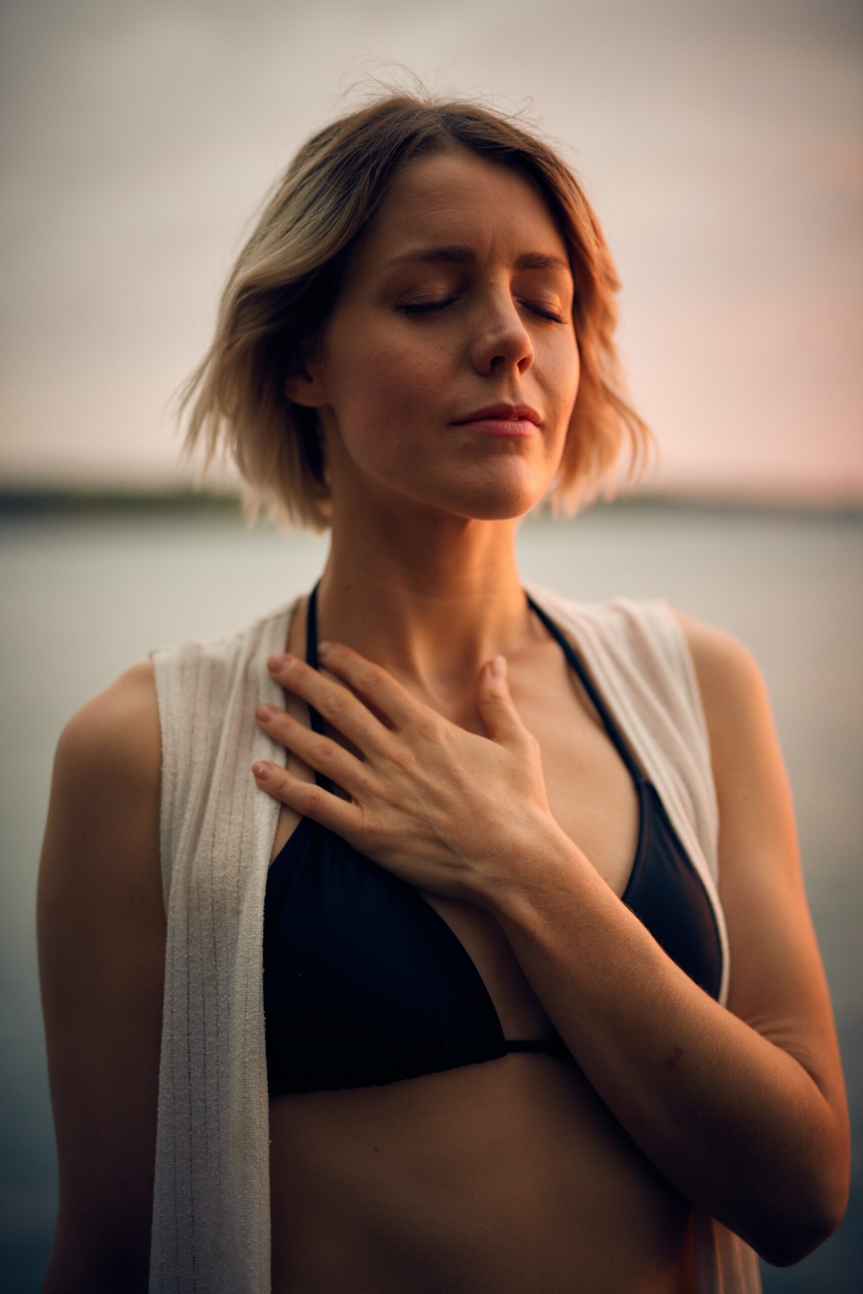
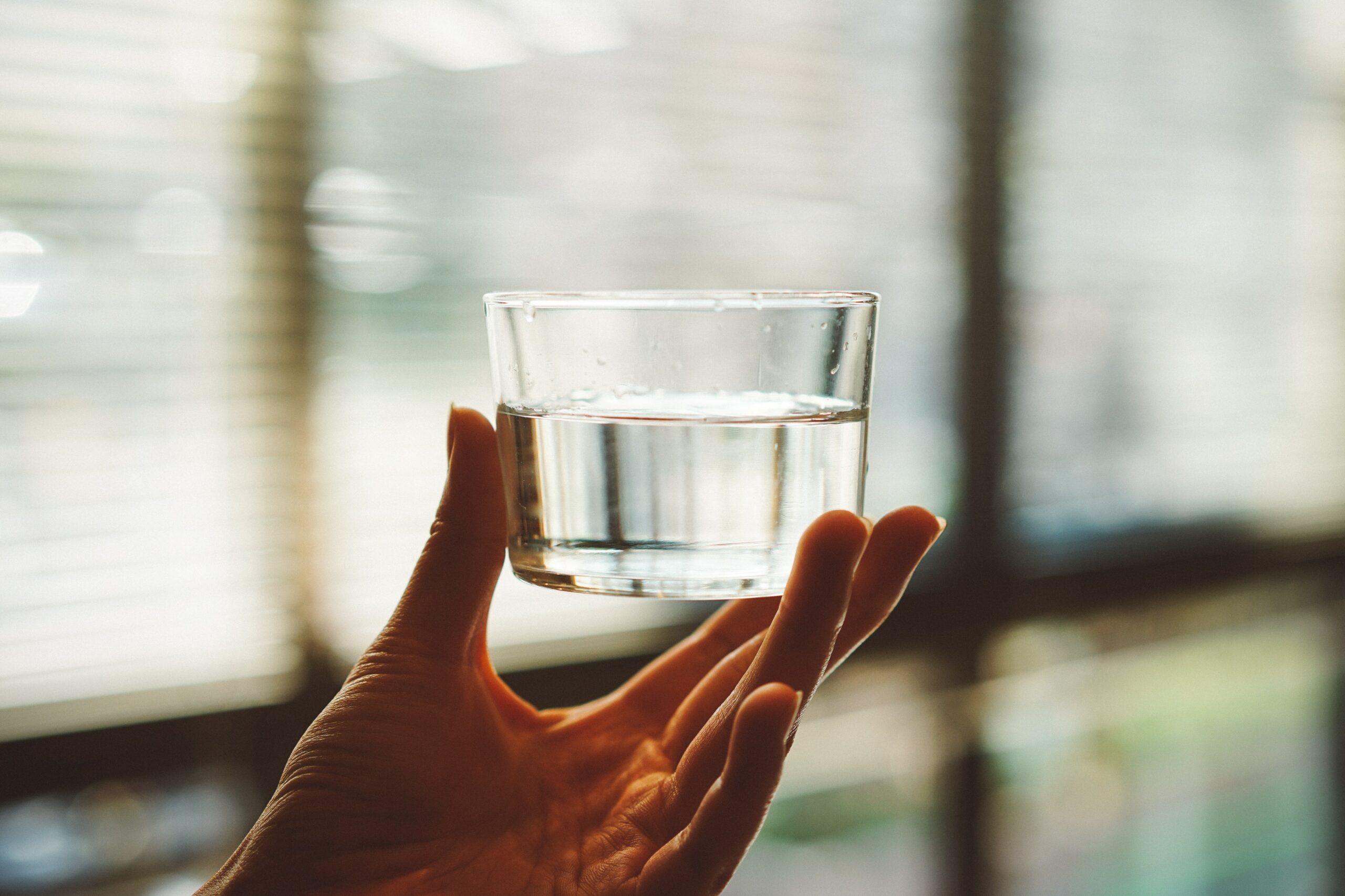
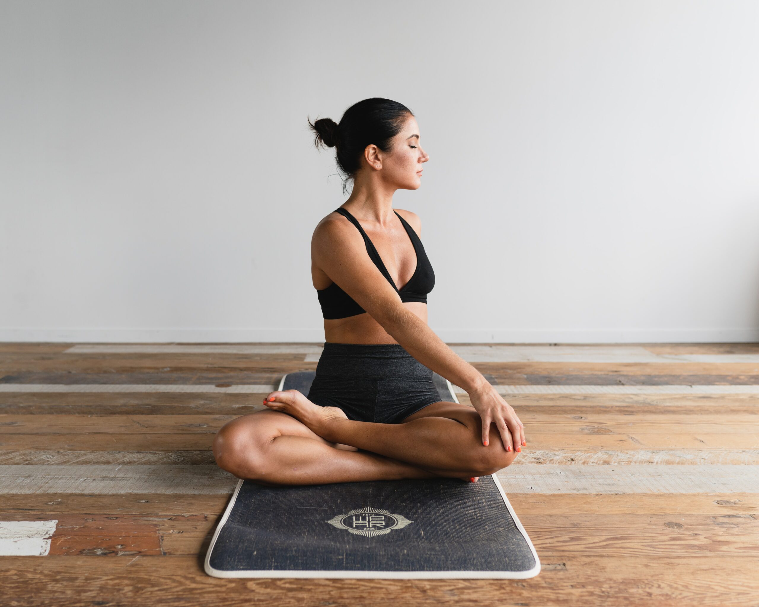
Proposal: Concept for this video is: Movement that heals. I’d like to showcase and promote movement as a tool for healing whatever you’re dealing with. During lower times of life, it’s easy to crawl into a hole of depression but there are ways to keep your physical and mental health strong. These strategies rely on movement, breath, meditation, and hydration which can help your state of mind. I want to encourage viewers to use these practices and find internal peace in times of hardship. The video will include a lot of light and white space. There will be clips of organic dancing and movement, combined with heavy breathing and a higher heart rate to encourage exercise. I want to show yoga poses and stretching, as well as comfortable poses for a relaxed meditation. There will be shots of drinking water to promote hydration and I want the ending to feel peaceful and centered after moving the body.
Formal Elements & Principles: Movement that heals. Promotion of movement, hydration, meditation, and anything (ion) that can help to reset your mind, body and soul.
Thumbnails:

TECH EX 07
Edit the Basics
For this exercise we edited a documentary trailer for a local ceramics artist Gordon Hutchens, who is also member of the NIC Fine Art faculty. I learned the basics of Adobe Premiere Pro editing software and followed the instructional video to complete the exercise. It was really interesting to see how you can edit video and sound content to separate them and edit it individually. With Premiere Pro, you have full control on the editing process and I feel like I just scratched the surface on the scale of what you’re able to do. I feel excited to continue to learn more about the software and the flexibility you have to create a really cool video.
TECH EX 06
Shot Composition:
For this exercise we were expected to take a series of images or find some that showed various shots and camera angles. I found that depending on the angle you take an image can affect the mood of the image majorly. For example a Dutch tilt angle creates tension and uneasiness or an over-the-shoulder can give you a similar point of view from the subject. No matter what you’re trying to capture, if you play around with the angles and shots, it can give you a completely different feeling and mood. I felt it pushed my comfort zone to capture images from these different point of views. Looking back on all the images I feel that I should take more risks taking pictures going forward and use the shots and angles to capture a specific mood.
Formal Elements Image Sequence + Analysis

Analysis:
Colour:
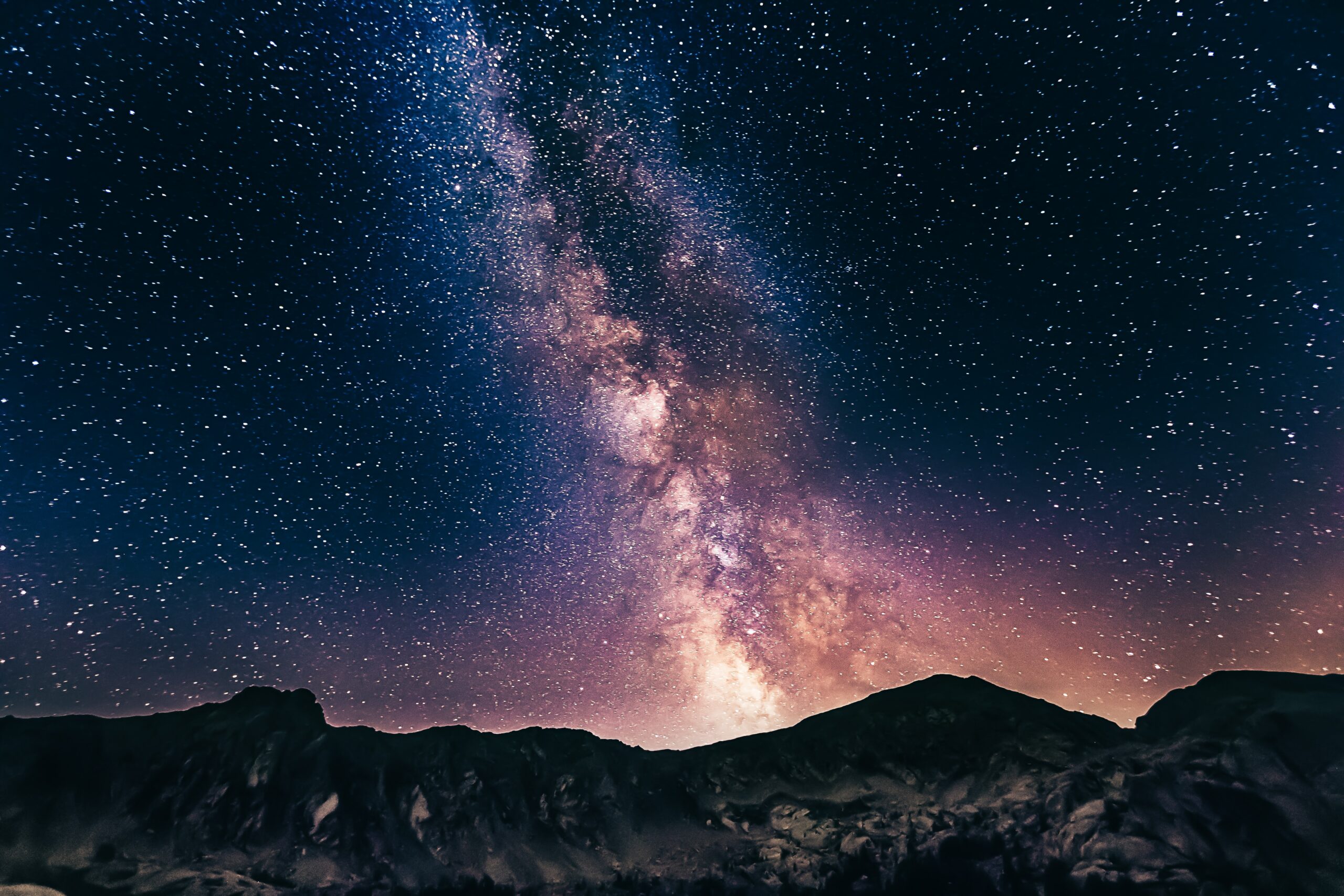
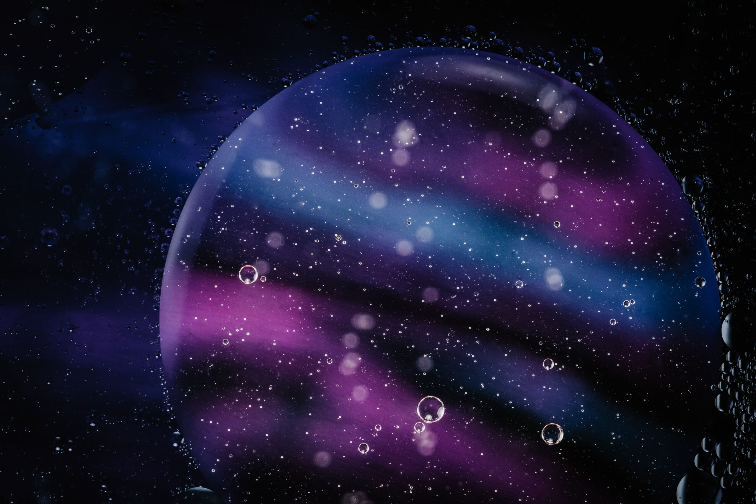
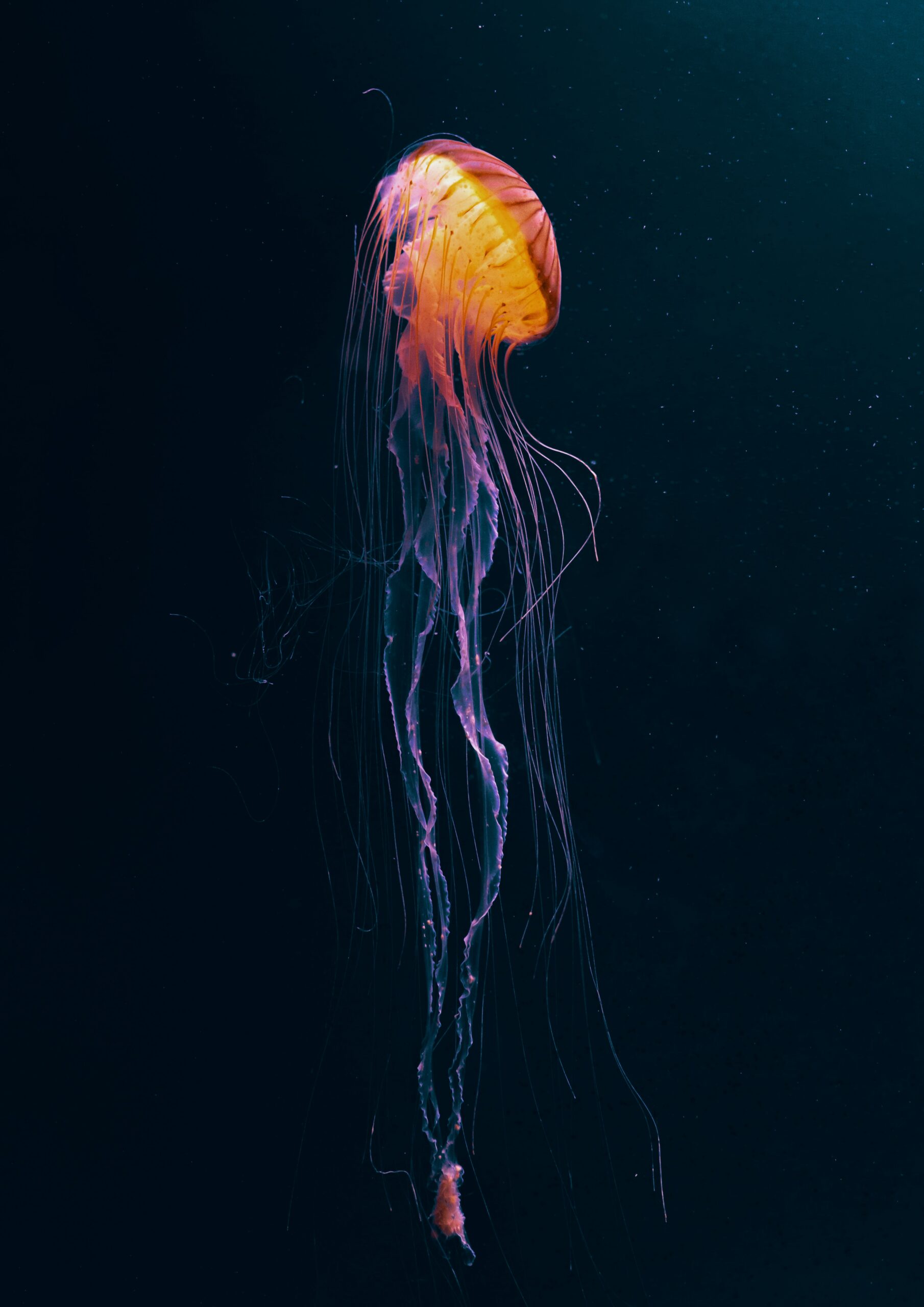
Each Image shares a similar colour palette. The palette reflects a complimentary and analogous colours so the colours work well with each other. The dominant colour is a deep purple with blue tones around it giving a far away, spacious feeling. There is pops of hues of orange which draws your eye around the images and adds some life to the sequence.
Line:
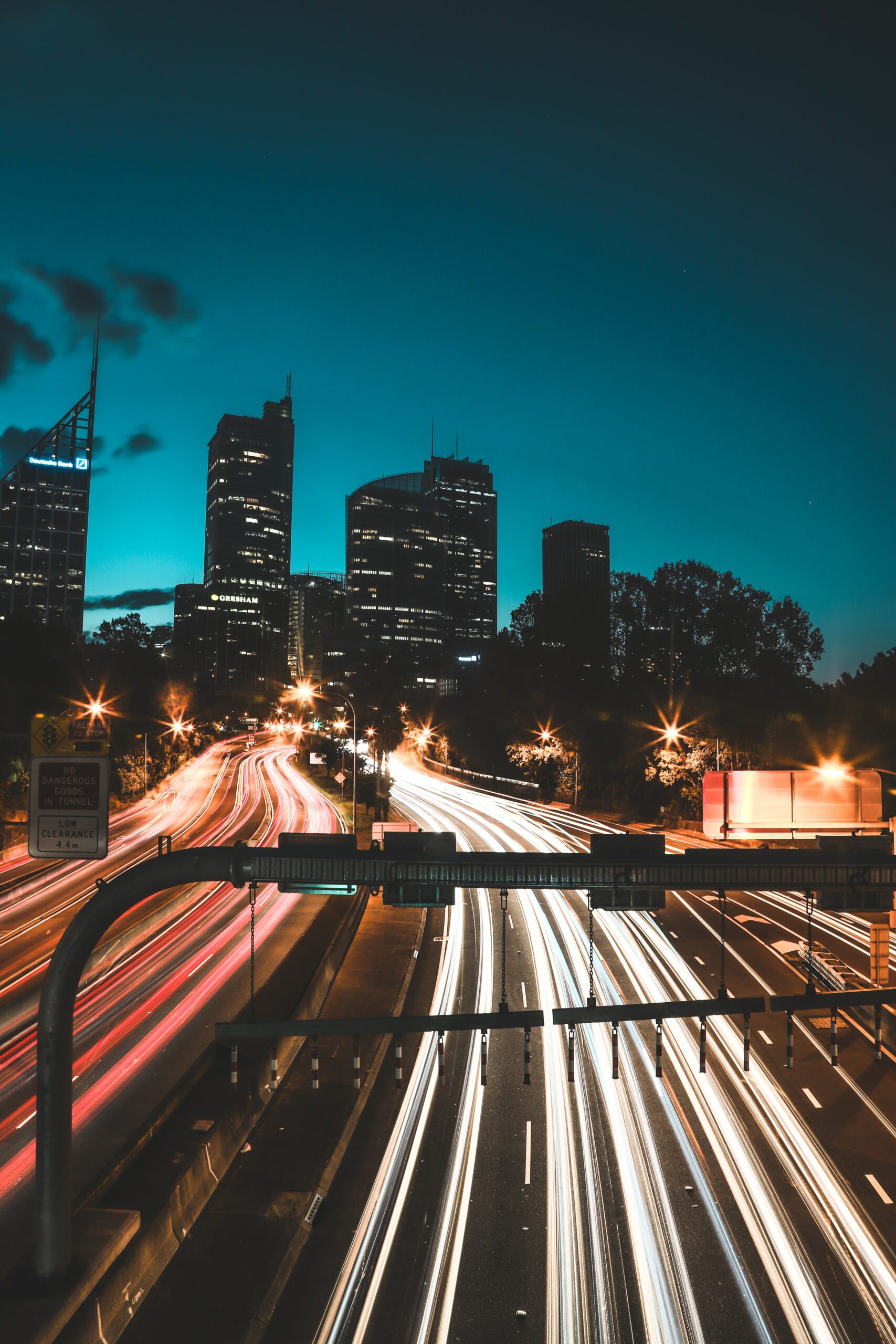
Line is the main relationship I can sense from the image sequence. Each image holds a leading line to a direction within the image. The top 3 images have leading lines towards the top left corner but each have achieved this in their own way. The Milky way and Confetti concert isn’t a direct line but instead is achieved with multiple small dots that form a line. The image with the jellyfish has it’s legs which are thin lines that draw your eye towards the main jellyfish head. The image with the car lights on the highway has this bright car lights along the road, against the dark background which lead your eye behind the buildings. The image with the large purple/blue circle has lines but instead is achieved with colour. Even though each image isn’t of the same thing, they all have lines created within the image.
Transparency:
Each image has layers of transparency within each image. The first milky way image, has layers within the galaxy of light, and colour. Each light is so far away from the human eye but in the image you can see all of the millions of layers creating this transparent space delight. The highway image uses the multi layers of the car lights along the road which plays with the mind and shows the speed of light. The confetti isn’t necessarily transparent, but having it thrown into the air with the concert lights flowing through each piece, gives it a transparent feeling combined with the holographic colour of the confetti. The large purple/blue circle image was created with oil and water, with lights shining through it. The photographer uses the natural state of oil and water to layer within each other and create this transparent effect that works well. The jellyfish is notoriously transparent, to show the colours and layers within the jellyfish itself. It creates this beautiful see-through animal and sits in the deep dark ocean which is of course transparent.
Negative Space:
Within the sequence, each image shares negative space but in different ways. The image with confetti as well as the milky way, have similar negative in between the speckles of light and confetti bits. The image with the car lights and jellyfish share negative space between the lines and the surrounding area. The purple/blue circle hold lots of negative space between the circles and dots around the image. Even though each image has different ways of showing negative space, between some images in the sequence has similar techniques which unifies them all in their own way.