
Celina’s accessibility report for the Digital Design and Development Website Landing page.
Reading through the Digital design and development website landing page, I thought it was very well laid out and relatively easy to use. I’ll begin by saying that I do think this website page is easy to use and is mostly accessible, however there’s always room improvement.
The cognitive load of the site is good. There’s clear hierarchy through out the page and it uses grouping and chunking sections of information really well to not overwhelm the site user and break up the page. There’s good use of anchors so you can easily jump around the page to find what you’re looking for easily. The site page isn’t consistent, but not necessarily in a bad way. There’s a lot of varied information within the page which makes for an unpredictable page but I think it works according to the information. I didn’t recognize any sort of grid pattern or cross referencing within the site page.
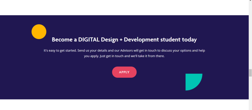
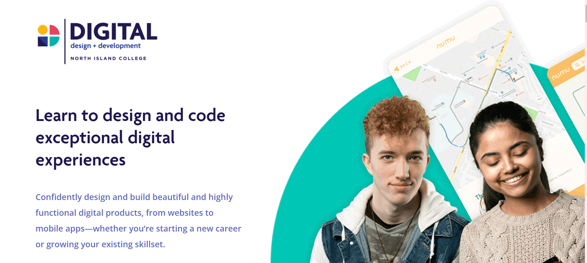
The language usage of the Digital Design and Development page is well done. The site page is scannable; most of the headings are easily readable but some headings are a little long to be able to scan the page quickly. All of the text is of good length. Paragraphs are kept at a good length as to not overwhelm the user and which will maintain interest. I didn’t read any jargon, and the information included was very straight forward without any use of homonyms or heteronyms. The language is all English, except when mentioning the First Nations territories where the school is located, but the section works for the purpose and is necessary to mention as it is also a reference point. I think the definitions and instructions for the buttons within the page are clear but could be a little larger font, especially the words like “Apply”, “Learn More”, and “Get In Touch”.
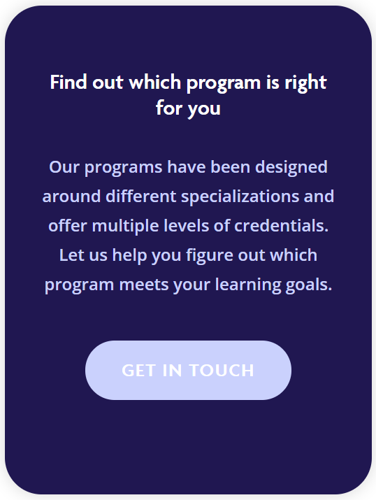
The Colour choices for the website work nicely together and they’re very on brand. I do think this is where the website could be improved. The colours chosen are really nice and they work for chunking sections of the website, however some of the text on buttons is a little hard to read. To create an even more accessible site page would be to change the button colours to another shade that has a stronger contrast. The typography type faces are a good choice as well. There is easy readability with the font size; some of the blocks of text could be improved with a thicker stroke contrast, specifically for the longer groups of texts.
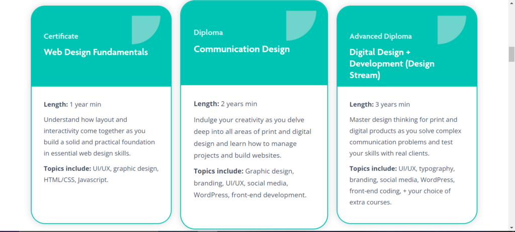
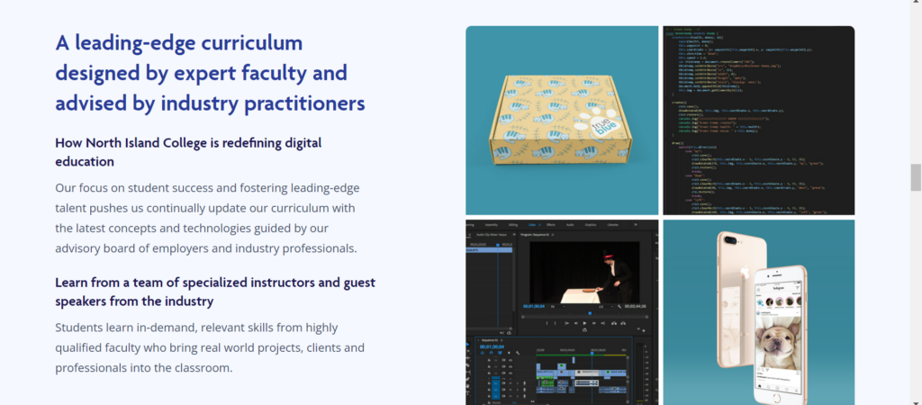
Perceivability of the website landing page is good. It could be improved by including alt text for the site images but the typefaces chosen and colours are for the most part, well done. The operability of the site page is another area where I think there could be improvements. There are a couple spots of the site where if you hover over a box, it will enlarge (See image above). This is great however, the enlarging box isn’t that obvious. To enhance this section, I would opt for an even larger area that the box expands to or change the colour of box when it’s being hovered. The button links on the site change colour when hovered which works, but the same method could be applied through the rest of the page.
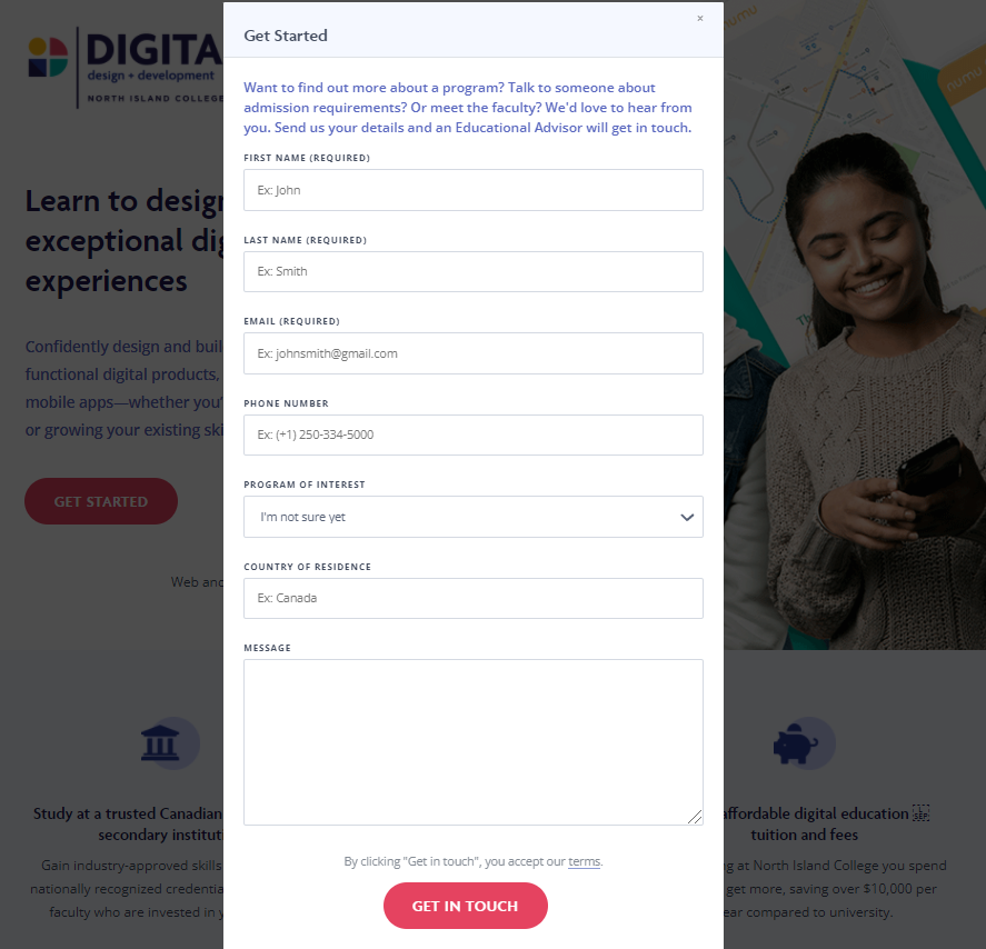
I think the Contact form has good Operability and is also Understandable. The form prompts the user with instructions and examples which enables the user to answer the questions without confusion. You can also access the form from multiple buttons on the page which is beneficial for user operability. The rest of the page site is also understandable by using smaller sections without long paragraphs of text and summarizes texts with proper headings.
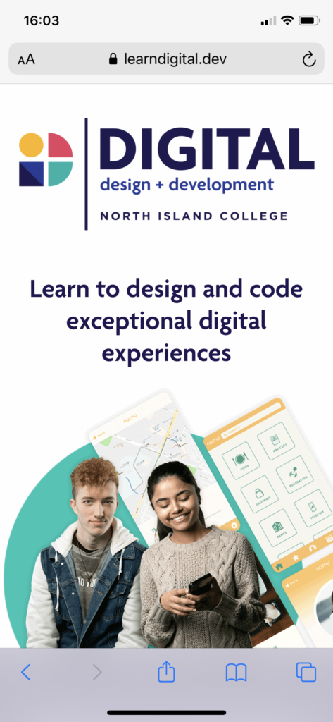
The Robustness of the site is also good and follows semantic HTML rules. The site works well on other browsers and I didn’t have any issues with loading times or links and the site operated similarly within each browser. The Mobile version of the Digital Design and Development site is also well done and is almost the exact same as the desktop version, but slightly more condensed. The mobile version works well, the program summarize sections enlarge when clicked and will collapse when clicked again. The contact form is the same layout and it works well for the mobile version.
My Score
My overall score for the Digital Design Landing page is 4/5. I think the website functions well and is user friendly and is mostly accessible. There are some improvements in terms of colour, and font choices that I would recommend updating. In terms of the accessibility challenges the site users face, I would consider to be Minor. The reason for this score, would be because the site follows proper accessibility guidelines and is also aesthetically pleasing. These design choices aren’t beneficial for the overall accessibility of the site but I think it could be easily improved with some minor changes.
Thanks for reading!