
Big Idea
Generating Ideas
Need Statements
Lionel, a stay at home father of 2, need to be able to buy delicious and unique cupcakes for school events and parties in order to focus on his kids rather than baking.
Five Sketches
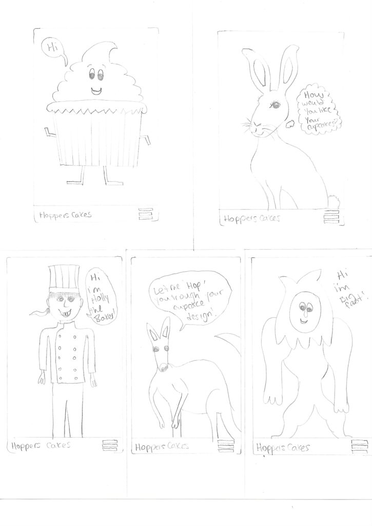
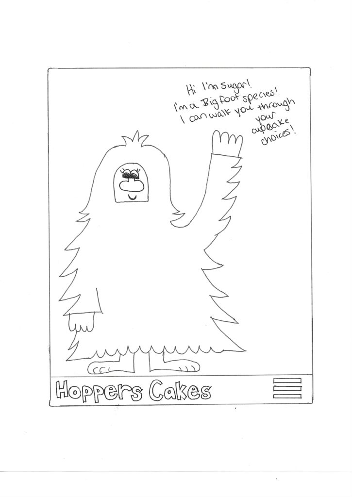
Final Sketch
Communication Strategy
Sugar the big foot, is Hoppers Cakes personal virtual assistant that will help customers purchase their chosen cupcakes. Sugar is a large white female Big foot, that loves cupcakes! After you’ve downloaded the app, you’ll create an account with Hoppers Cakes and log in. Once you’ve logged in, Sugar will appear and introduce herself to the user. Sugar will show you around the app and how to use the interface where you can follow the tutorial or skip through it. Sugar will walk you through your first cupcake purchase and point out where to put special requests, allergies, or cupcake options. Sugar and the overall design will be a fun, warm, and playful design. There will be a FAQ section where Sugar will pop up with the answers. After your purchase, Sugar will walk you through the pickup process before arriving at the location.
Team Roles
Graphic Designer
For this project, I assigned myself for this role. The Graphic designer position will be responsible to conceptualize and produce the visual art that will used for the new product. The graphic designer will be in charge of the creative aspect of the project and executing the design of the product. For this project, as the graphic designer I will be responsible for:
- Create the brand identity of the product
- Figuring out the style guide, and Logo
- Design lay outs for publications and marketing uses
- Create ads, and infographics
- Create all visual assets that will be used for marketing
- Maintain and clean and consistent and cohesive look
- Work closely with the UI designer and Marketing Director
- Ensure the visual communication and brand standards are met
User Experience Designer
The user experience designer is responsible for any interaction the user has with a product. Or in this case, the web app for pilots. The UX designer will be responsible for everything that involves how the web app works, how it feels, how easy it is to use, how to access different sections of the app and etc. The User Experience Designer will be a managerial position and the UI Designer and Developers will answer to the UX Designer. As well as:
- Fully ideate the product
- Understand problems within app and how to solve them
- Conduct research about the app and it’s uses
- Conduct user testing and provide feedback to the team
- Create an experience strategy
- Organize the app content
User Interface Designer
The User Interface (UI) Designer is responsible for all of the visual aspects of the web app itself. It’s the actual interface of a product, and the navigation within the app. This includes the visual and interactive elements, like buttons, the typography and the animations. The UI designer will answer to the UX designer and works closely with the graphic designer. For this project the UI designer will be responsible for:
- Create wire frames of the whole app
- App prototypes that people can use
- Create final prototypes of app before it’s sent to be coded
- Ensures consistency and follows style guide
- Creates each page of app and designs placements, spacing, visual spacing
- Designs all versions of app, for mobile, desktop, screen reader, etc
- Designs elements such as buttons, icons, sliders, animations , etc
Developer
The front end developer is a coder responsible for the part of the app that a user sees and interacts with. Their role is to make sure the user experience is smooth and easy to use. A back end developer is responsible for the app architecture, figuring out the service and database communication. API integration and ensuring the product is secure and stable. For this position, I’m going to combine these roles and have one person responsible for the front and back end coding. The developer will answer to the UX Designer. The developer responsibilities include:
- Code the front of the app
- Codes layout and interaction within app
- Follows style guide and ensures app is consistent
- Tests code
- Ensures code works the way it was designed to
- Ensures consistency within all browsers
- Ensures SEO strategy is implemented within app
- Codes back end of app
- Create a database to store information the app will store about weather, flight locations, and related information
Marketing Director
The manger director is responsible for planning, developing and implementing the marketing strategy for the app. They will come up with a plan and the create all of the marketing material for the project including the planning and organization of it all. They will be working with the graphic designer to ensure brand consistency, and follows project missions and values. They will be responsible for all digital marketing platforms and managing the project content. Other responsibilities include:
- Come up with marketing plan including ads, social media and etc
- Develop and implement SEO strategy
- Create all written content for marketing
- Build marketing strategy
- Prepare and manage marketing strategy
- Measure marketing content
- Look at competition, suggest improvements
- Promotes brand identity and product through many digital platforms
Celina – Collaborative Software
1. Team Communication: Slack
- Slack allows us to use instant messaging so that we are always able to be in contact with one another. Unlike Facebook, Slack allows us to create channels to organize our conversations, add threads to those conversations and archive our channels so that we always have an easily searchable record of previous discussions. Slack integrates with Google Docs so we can share files easily.
- A potential problem is that it may be difficult to find conversations when there are alot of different channels and private messages.
2. Document Sharing: Google Drive
- Google Drive is a free platform that is used for many things but in particular is great for file sharing. You can share individual files or many files at once. Google is beneficial because your files are backed up to the cloud. There’s multiple ways to share documents via a link or a physical file share. The interface is easy to navigate and compatible with Microsoft office. You can upload pictures, videos, pdf’s, and presentations. Google easily integrates with Slack.
3. Version Control: GitHub
- GitHub is a great version control tool because, you’re able to keep track of your work and it allows you to explore changes you’ve made. You can also manage these past changes and makes managing files very easy. These files are uploaded to the web, which is beneficial for team work. As a team you can collaborate together on projects.
- A potential problem of GitHub is managing who made changes and possibly overriding each other’s work.
4. Prototyping: InVision
- InVision is a great prototyping platform for team use. With their easy to use platform, you can create prototypes quickly and hassle-free. One of the main benefits of using InVision is LiveShare. You can collaborate with your team members and share the creation process through a live stream. Team members can comment on each other’s work for specific project creations and you’re able to view content in “presentation mode” and get a real view of how projects will look on the web. There are no limitations for storing and sharing files within teams. Invision is also compatible with Slack.
- A potential problem with Invision is that it is not a free platform, however, they do offer a free trial.
5. Time Tracking: Clockify
- Clockify is a free time tracker and time sheet app that lets you track work hours across projects. You’re able to easily see where your team is spending time and use the information to increase productivity. With Clockify you can track billable times and use the information to show clients. You can track attendance which is beneficial for accounting and payroll and overall boost efficiency. You’re also allowed an unlimited amount of users, for free.
6. Project Management: Monday
- Monday is an easy to use and intuitive project management software that is known for being a “task management solution”. Monday offers different board views that enable team members to plan, manage and track workflow. With the boards, teams can organize tasks and ongoing projects. You can keep track of communications like phone calls, emails, social media posts, etc and manage communications statuses. You’re able to develop and track projects and communicate with team members about any and all information referring to feedback, edits, pricing, and more.
- A potential Problem with Monday could be challenging to track time on tasks.
7. Code Testing: Mocha
Mocha is a great code testing platform. Mocha allows you to check and test the code easily. You can make changes fast, and there’s easier opportunity to fix code bugs early on. There are multiple ways to test using Mocha, and it is compatible with many different browsers. Mocha is also highly extensible and flexible.
8. Digital Marketing Analytics: Improvado
- Analyzing and tracking data is necessary to evaluate your performance. Improvado is beneficial by their ETL (Extract, Transform, Load) system. You can automate data aggregation from multiple sources for a streamlined solution and extract data from multiple sources. With the compiled information you’re able to view the information in a unified form. From there you can clean up and improve your data as necessary.
9. SEO (Search Engine Optimization): Agency Analytics
- SEO’s are important for your business and Agency Analytics is a great option to track, organize, save and target your SEO keywords and phrases. Agency Analytics, enables you to track rankings, identify SEO issues, and track competitor SEO’s. You’re able to track the search terms which are updated daily. You can also track locations and languages of these. With Agency Analytics you can brand it according to your company and schedule reports easily. You’re also able to make comments and streamline the communication through direct comments.
10. Page Speed Testing: PageSpeed Insights
- PageSpeed Insights is a free web performance tool that enables you to create fast and mobile friendly websites. They analyze the content of a site and generate solutions to make an even faster web page. They test the speed load time of webpage and determines the overall loading time of the time. With that information, you can make changes and improve the overall loading speed and improve customer experience of your website.
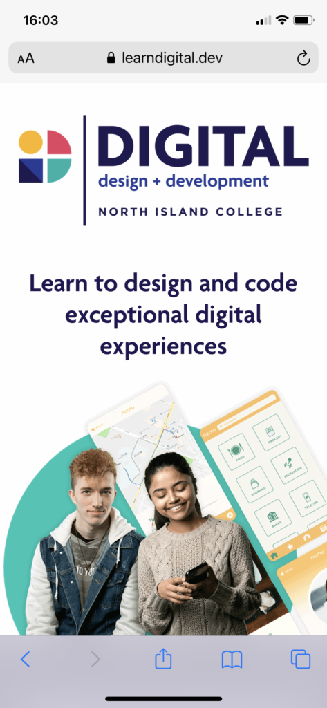
Accessibility Audit
Celina’s accessibility report for the Digital Design and Development Website Landing page.
Reading through the Digital design and development website landing page, I thought it was very well laid out and relatively easy to use. I’ll begin by saying that I do think this website page is easy to use and is mostly accessible, however there’s always room improvement.
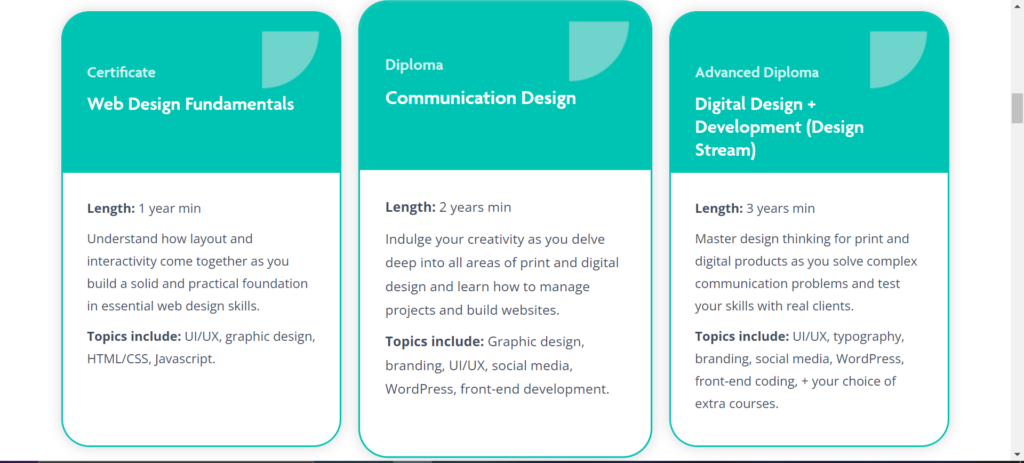
The cognitive load of the site is good. There’s clear hierarchy through out the page and it uses grouping and chunking sections of information really well to not overwhelm the site user and break up the page. There’s good use of anchors so you can easily jump around the page to find what you’re looking for easily. The site page isn’t consistent, but not necessarily in a bad way. There’s a lot of varied information within the page which makes for an unpredictable page but I think it works according to the information. I didn’t recognize any sort of grid pattern or cross referencing within the site page.
The language usage of the Digital Design and Development page is well done. The site page is scannable; most of the headings are easily readable but some headings are a little long to be able to scan the page quickly. All of the text is of good length. Paragraphs are kept at a good length as to not overwhelm the user and which will maintain interest. I didn’t read any jargon, and the information included was very straight forward without any use of homonyms or heteronyms. The language is all English, except when mentioning the First Nations territories where the school is located, but the section works for the purpose and is necessary to mention as it is also a reference point. I think the definitions and instructions for the buttons within the page are clear but could be a little larger font, especially the words like “Apply”, “Learn More”, and “Get In Touch”.
The Colour choices for the website work nicely together and they’re very on brand. I do think this is where the website could be improved. The colours chosen are really nice and they work for chunking sections of the website, however some of the text on buttons is a little hard to read. To create an even more accessible site page would be to change the button colours to another shade that has a stronger contrast. The typography type faces are a good choice as well. There is easy readability with the font size; some of the blocks of text could be improved with a thicker stroke contrast, specifically for the longer groups of texts.
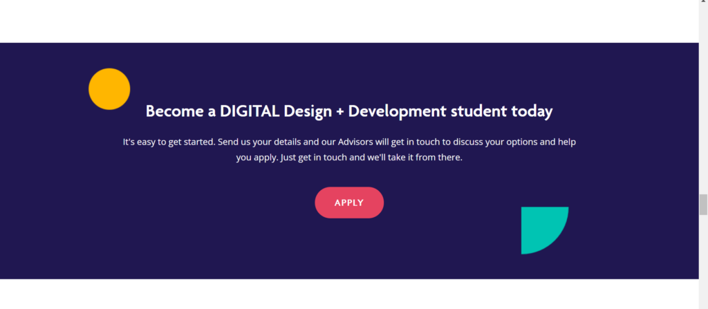
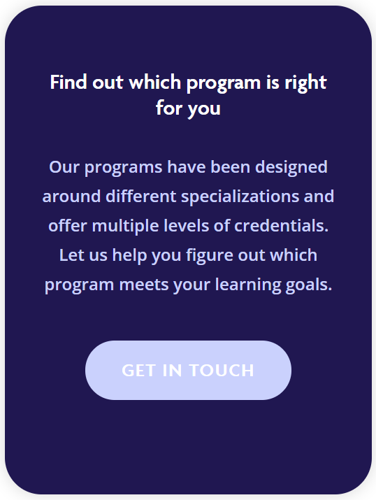
Perceivability of the website landing page is good. It could be improved by including alt text for the site images but the typefaces chosen and colours are for the most part, well done. The operability of the site page is another area where I think there could be improvements. There are a couple spots of the site where if you hover over a box, it will enlarge (See image above). This is great however, the enlarging box isn’t that obvious. To enhance this section, I would opt for an even larger area that the box expands to or change the colour of box when it’s being hovered. The button links on the site change colour when hovered which works, but the same method could be applied through the rest of the page.
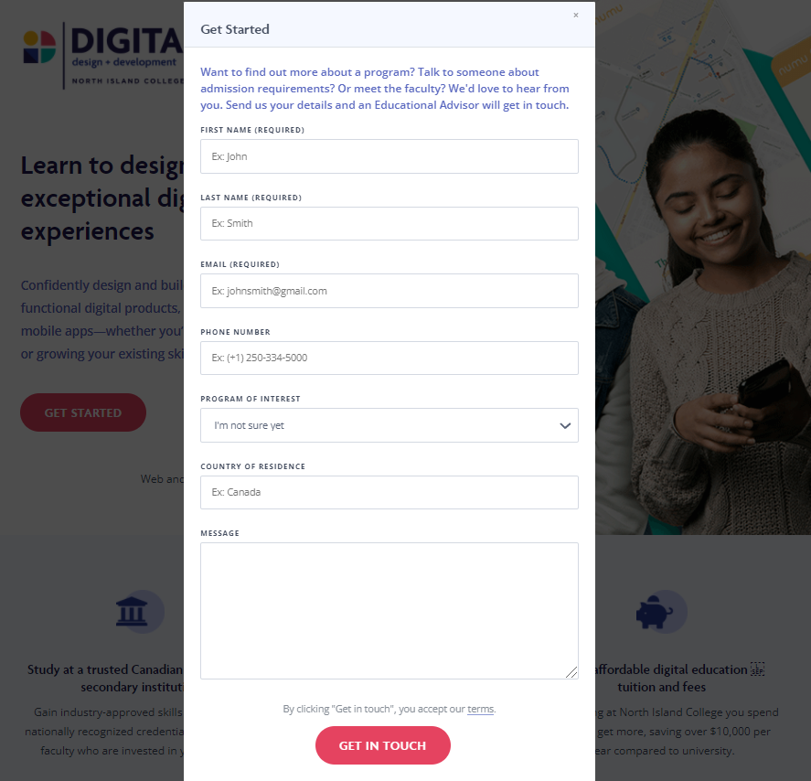
I think the Contact form has good Operability and is also Understandable. The form prompts the user with instructions and examples which enables the user to answer the questions without confusion. You can also access the form from multiple buttons on the page which is beneficial for user operability. The rest of the page site is also understandable by using smaller sections without long paragraphs of text and summarizes texts with proper headings.
The Robustness of the site is also good and follows semantic HTML rules. The site works well on other browsers and I didn’t have any issues with loading times or links and the site operated similarly within each browser. The Mobile version of the Digital Design and Development site is also well done and is almost the exact same as the desktop version, but slightly more condensed. The mobile version works well, the program summarize sections enlarge when clicked and will collapse when clicked again. The contact form is the same layout and it works well for the mobile version.
My Score
My overall score for the Digital Design Landing page is 4/5. I think the website functions well and is user friendly and is mostly accessible. There are some improvements in terms of colour, and font choices that I would recommend updating. In terms of the accessibility challenges the site users face, I would consider to be Minor. The reason for this score, would be because the site follows proper accessibility guidelines and is also aesthetically pleasing. These design choices aren’t beneficial for the overall accessibility of the site but I think it could be easily improved with some minor changes.
Thanks for reading!
SEO
2A-6
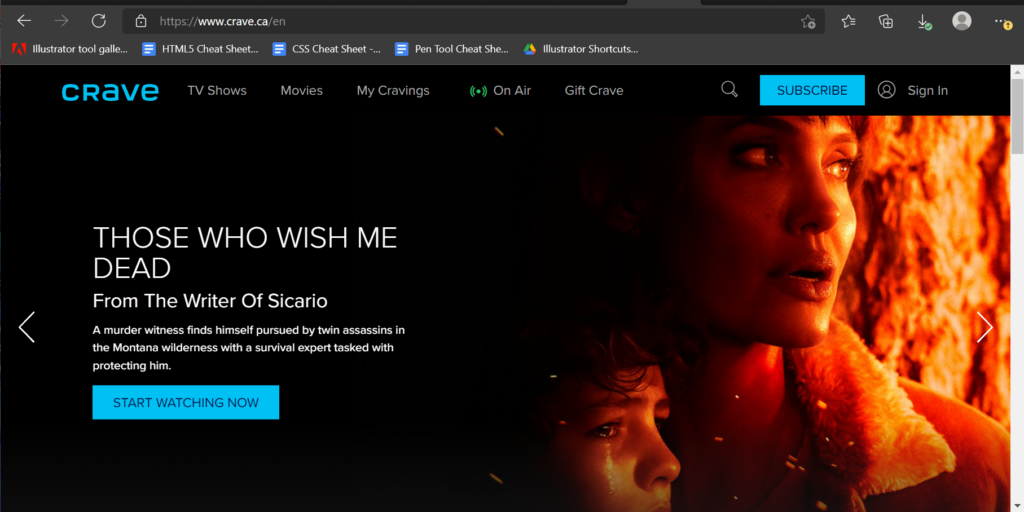
Entertainment: Crave
Crave is an online subscription video service. Formerly known as CraveTV, and is owned by Bell media. It was founded in 2014 and the headquarters are based in Toronto. You can purchase a subscription through Crave directly or buy it as an add on service through your television provider. Crave also offers premium channels as an extra add on cost. Crave does offer a 7 day free trial for consumers for first time customers only.
2A-5
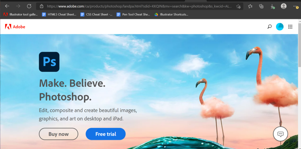
Software as a Service: Adobe Photoshop
Adobe Photoshop is a very popular product from Adobe Inc and was originally created in 1990. Adobe Photoshop is a subscription service offered by Adobe. Adobe also has developed and published many other products like it. Adobe generates revenue through subscriptions and licenses by selling software for creative uses. Adobe products offer a 7 day free trial as a loss leader.
2A-4
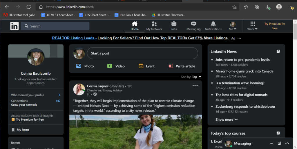
Community: LinkedIn
LinkedIn is an online community for professionals to connect socially. LinkedIn is owned by Microsoft founded in 2003 and is based in California but has offices world wide. LinkedIn allows employees to upload their resumes and apply for various company positions directly on the site. LinkedIn is primarily used for networking and professional connections. LinkedIn makes their revenue by subscriptions, advertisements and through recruitment. Ads are paid out through the pay-per-click (PPC) model. Consumers can subscribe and acquire access to premium services or by selling information to recruitment agencies.
2A-3
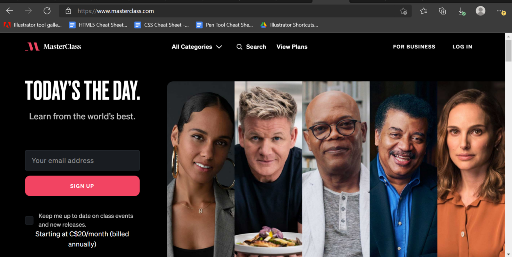
Information: Masterclass
Masterclass is an online learning platform and was founded in 2014 and based in San Francisco California. Masterclass is a subscription platform where people can learn about various topics from well known and notable celebrities instructing about their own niche. Consumers can purchase an annual subscription for an “all access pass” for $180, or pay $15 per month. Or consumers can pay $90 for access to one individual class. Customers will receive work books and will complete assignments throughout the course. Masterclass also offer 30 day free trial for new customers.